VisitCopenhagen Brand Identity

Project Brief:
In fall 2018, Jeanette Hendeliowitz, instructor of the Graphic Design Foundations course for the Danish Institute for Study Abroad (DIS), tasked students with rebranding VisitCopenhagen, the city’s official tourism organization.
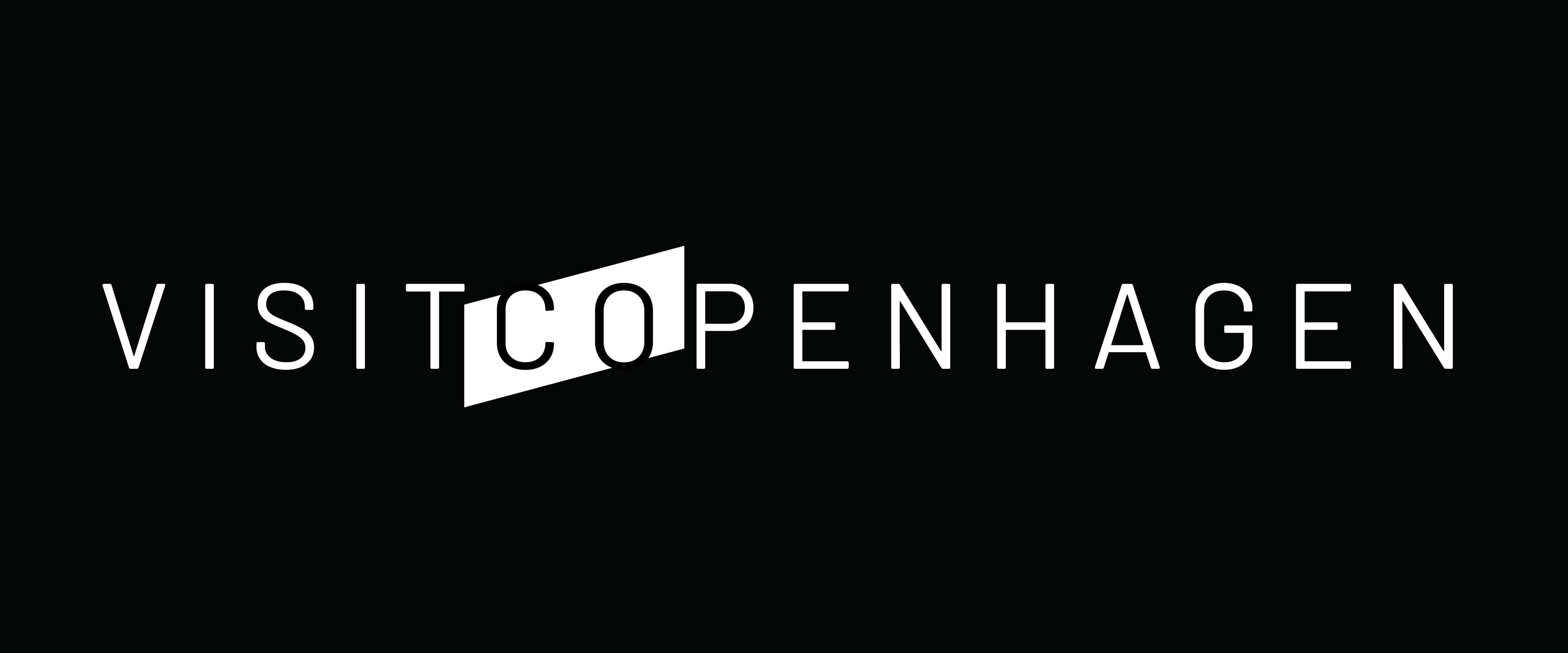
VisitCopenhagen’s 2020 strategy aims to create a “shared experience of localhood” for today’s traveller. Through word-of-mouth recommendations and interactions with local citizens, tourists will be immersed in the culture and lifestyle of the city.
The direction towards a new age of tourism inspired a classic yet modern aesthetic. The emphasis on co-creation between visitors and locals also served as inspiration for the new logo’s icon, typography, and interaction between the two.
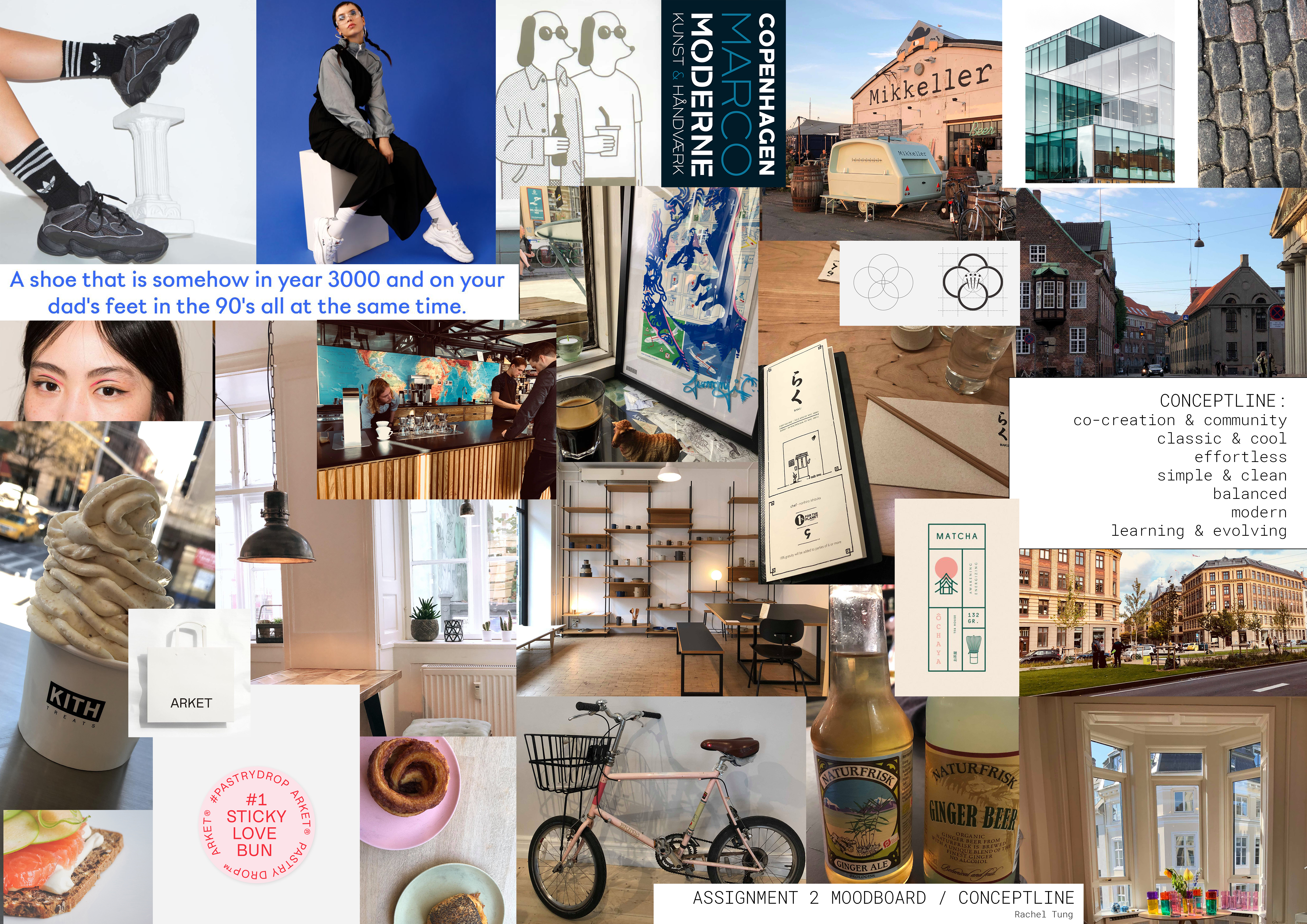
In fall 2018, Jeanette Hendeliowitz, instructor of the Graphic Design Foundations course for the Danish Institute for Study Abroad (DIS), tasked students with rebranding VisitCopenhagen, the city’s official tourism organization.
VisitCopenhagen’s 2020 strategy aims to create a “shared experience of localhood” for today’s traveller. Through word-of-mouth recommendations and interactions with local citizens, tourists will be immersed in the culture and lifestyle of the city.
The direction towards a new age of tourism inspired a classic yet modern aesthetic. The emphasis on co-creation between visitors and locals also served as inspiration for the new logo’s icon, typography, and interaction between the two.
Moodboard
Images of street fashion, Danish architecture, minimalist designs, as well as personal photographs of the city provided inspiration for a contemporary, clean, and cool aesthetic.
Sketching and Iteration
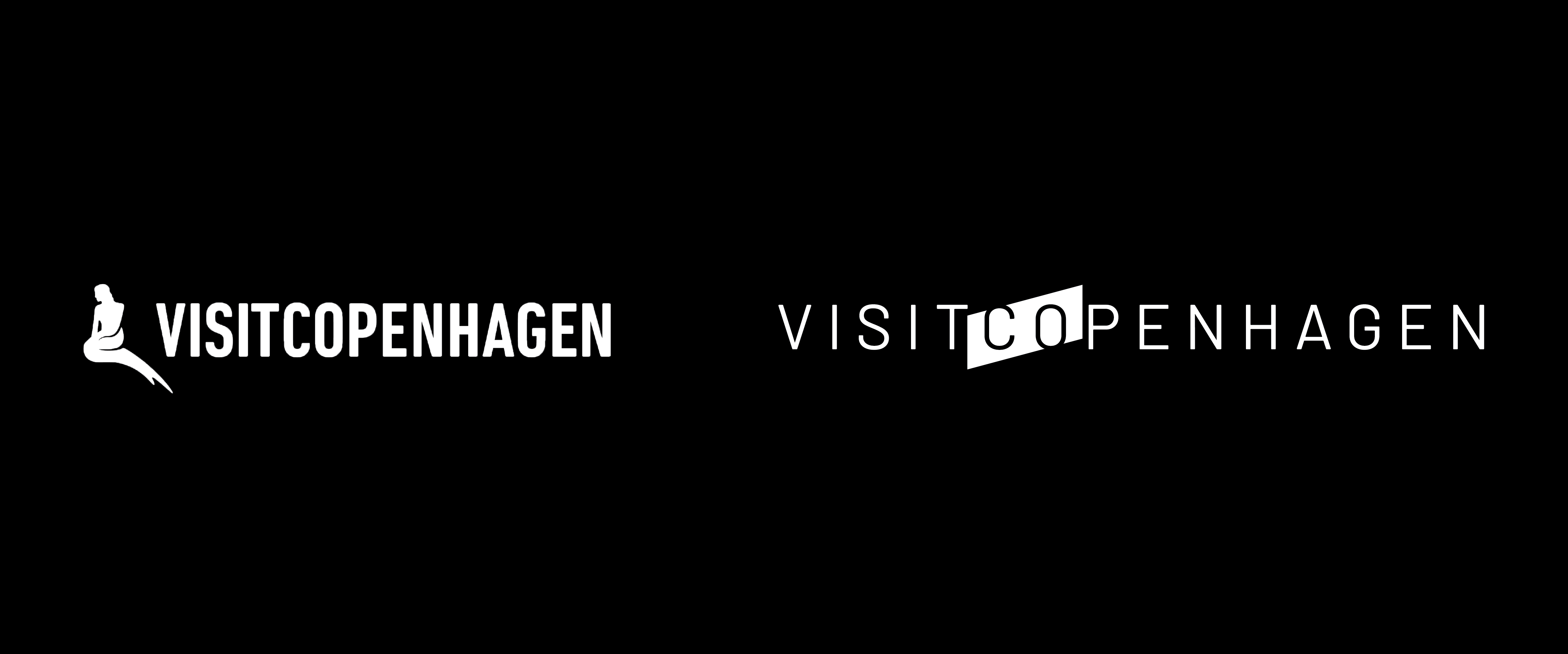
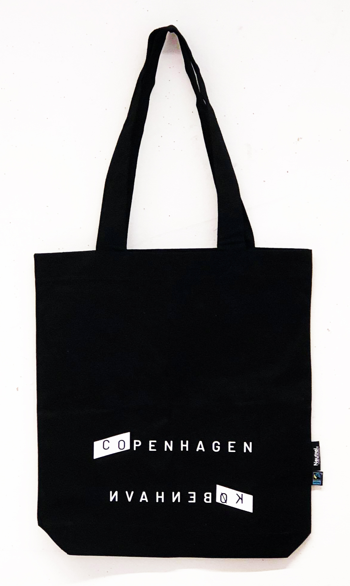
The letters “Ø” and “V” from the Danish alphabet inspired shapes for initial logo sketches. To integrate the shapes with the company name, the “CO” in Copenhagen is highlighted with a diagonal line, or forward slash. The diagonal line is an homage to the Danish vowel Ø, but also emphasizes VisitCopenhagen’s move toward a travel experience rooted in co-creation, community, and collaboration.